Creating a website involves more than selecting images and arranging content; typography is crucial to the overall aesthetic and functionality. The right fonts can enhance readability, convey the intended mood, and establish a brand identity. Choosing the right fonts for your website can be daunting, given the many options available. This blog will discuss how to choose the right fonts for your Website. The Web Design Course in Chennai at FITA Academy provides valuable insights into effective typography and overall design principles.
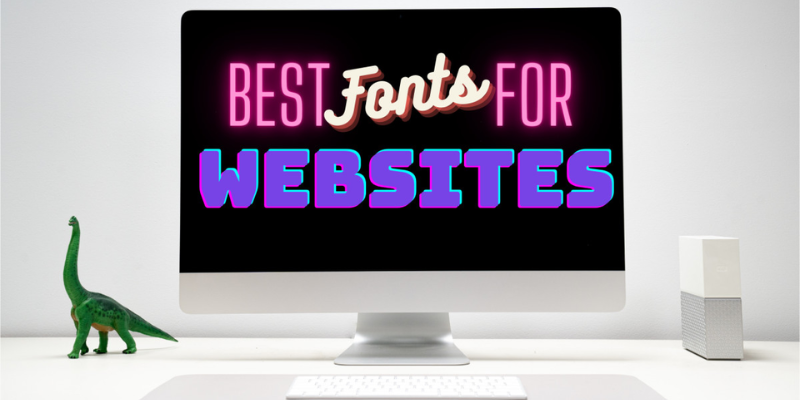
Typography in Web Design
Typography is a fundamental element of web design that significantly impacts user experience. Fonts are not just about aesthetics; they influence how content is perceived and interacted with. The right font choices can make a website look professional, trustworthy, and engaging. On the other hand, poor font choices can lead to readability issues and a lack of visual appeal, potentially driving users away.
Understand Your Brand Identity
The first step in choosing the right fonts is understanding your brand identity. Your typefaces should convey your brand’s personality and ideals. For instance, a law firm might opt for traditional serif fonts to convey professionalism and reliability. At the same time, a tech startup might choose sleek, modern sans-serif fonts to express innovation and forward-thinking.
Serif vs. Sans-Serif
- Serif Fonts: These fonts have small lines or extensions at the ends of letters. They are often perceived as formal, classic, and trustworthy. Examples include Georgia and Times New Roman.
- Sans-Serif Fonts: These fonts lack the small lines at the ends of letters, giving them a cleaner and more modern appearance. Examples include Helvetica, Arial, and Verdana. They are often seen as more casual and contemporary.
Consider Readability
Readability is a critical factor when choosing fonts for your website. Your primary goal is to ensure that visitors can easily read and understand the content. Here are some tips to enhance readability:
Font Size
Ensure that your font size is large enough to be read comfortably on various devices. Typically, a font size of 16px is considered the minimum for body text. Larger font sizes can be used for headings to create a clear hierarchy.
Line Spacing
Proper line spacing, or leading, improves readability by giving text enough space to breathe. Establishing line spacing for body text at 1.5 times the font size is a good general rule of thumb.
Contrast
High contrast between text and background enhances readability. Ensure that your text color stands out against the background color. For example, black text on a white background is highly readable, while low contrast combinations, like grey text on a light grey background, should be avoided. Enrolling in the Web Designing Course can provide additional guidance on achieving optimal contrast and readability in your designs.
Limit the Number of Fonts
Using too many different fonts on a single website can make it look cluttered and unprofessional. It’s best to limit your website to two or three fonts:
- Primary Font: Used for body text and the majority of your content.
- Secondary Font: Used for headings, subheadings, and other standout elements.
- Accent Font: An optional font used sparingly for special purposes, like call-to-action buttons or quotes.
Pair Fonts Effectively
When using multiple fonts, it’s important to pair them effectively to create a harmonious and visually appealing design. Here are some tips for successful font pairing:
Complementary Fonts
Choose fonts that complement each other in style but offer enough contrast to distinguish different types of content. For instance, pairing a serif font for headings with a sans-serif font for body text can create a balanced and professional look.
Similar X-Height
X-height refers to the height of the lowercase letters in a font. Fonts with similar x-heights tend to pair well together because they maintain a consistent visual rhythm.
Avoid Conflicting Styles
Avoid pairing fonts that are too similar or too contrasting. For example, pairing two different serif fonts can create visual conflict, while pairing a decorative font with a highly modern sans-serif font might look disjointed.
Test Fonts on Different Devices
Websites are viewed on various devices, from desktop computers to smartphones. It’s essential to test your chosen fonts across different screen sizes and resolutions to ensure they remain readable and visually appealing. Responsive web design practices can help you achieve consistent typography across all devices.
Web-Safe Fonts and Web Fonts
When selecting fonts, you have the option to choose between web-safe fonts and web fonts:
Web-Safe Fonts
Web-safe fonts are pre-installed on most operating systems, ensuring consistent display across different devices. Common web-safe fonts include Arial, Times New Roman, and Courier New. While these fonts offer reliability, they are limited in variety and may not fully align with your brand identity.
Web Fonts
Web fonts can be loaded from the web using services like Google Fonts or Adobe Fonts. These fonts offer a wider range of styles and can enhance your website’s uniqueness. However, using too many web fonts can slow your website’s loading time, so it’s important to balance aesthetic appeal with performance.
Choosing the right fonts for your website is a crucial aspect of web design that impacts both aesthetics and usability. By understanding your brand identity, considering readability, limiting the number of fonts, pairing fonts effectively, testing on different devices, and balancing web-safe and web fonts, you can create a visually appealing and user-friendly website. Thoughtful font selection enhances the overall user experience, ensuring that your website looks great and effectively communicates your message. Training Institute in Chennai can provide further insights and practical knowledge on these essential aspects of web design.